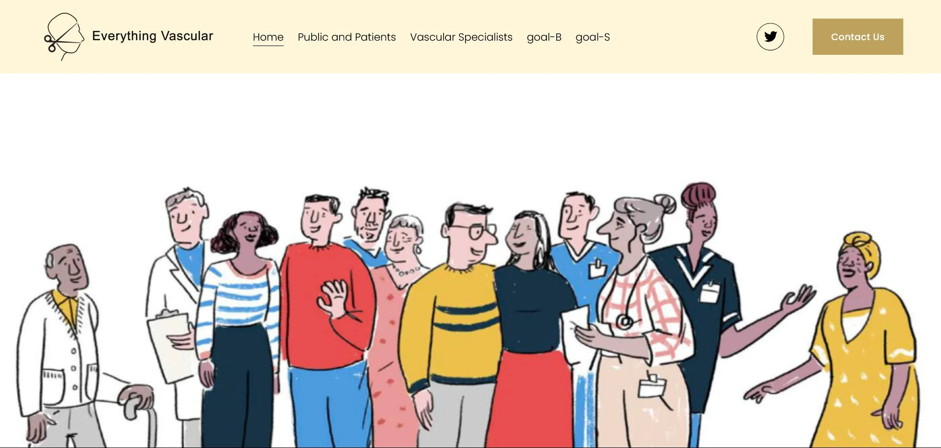
How to Keep Your Centered Header Navigation on One Line in Squarespace 7.1
In this tutorial, you'll learn how to prevent navigation links in the centered header layout from wrapping onto multiple lines in Squarespace 7.1. This update ensures your menu stays clean, balanced, and aligned in a single row regardless of how many links you have without affecting the header layout across the rest of your site.
Table of Contents
Why the trouble occurs
The centered-links header in Squarespace 7.1 is known for one frustrating quirk: even when there appears to be sufficient horizontal space, the navigation links can unexpectedly wrap onto multiple lines and disrupt the layout. This happens because of how Squarespace distributes space between the logo, nav, and action items by default.
When the logo and actions hog more room than expected, the nav area gets compressed and drops links to a second line — often when you least expect it.
The new code solution
Here is a refined LESS/CSS snippet that prevents the nav from wrapping and ensures your header always fits within the viewport:
Step-by-step instructions
Step 1: From the Squarespace dashboard navigate to Pages > Custom Code > Custom CSS and paste the code below
@logoArea: 18%; // percentage width reserved for logo + actions
@navMin: 50%;   // minimum width for nav area
@navMax: 64%;   // maximum width for nav area

.header-layout-nav-center .header-display-desktop {
  width: 100%;
  max-width: 100vw;
  overflow-x: hidden;

  .header-title-nav-wrapper {
    display: flex;
    align-items: center;
    width: 100%;
    max-width: 100%;
    overflow: hidden;
  }

  .header-title {
    width: @logoArea;
    flex: 0 0 @logoArea;
    max-width: @logoArea;
    overflow: hidden;
  }

  .header-actions {
    width: @logoArea;
    flex: 0 0 @logoArea;
    max-width: @logoArea;
    overflow: hidden;
  }

  .header-nav {
    flex: 1 1 auto;
    width: calc(100% - (@logoArea * 2));
    max-width: calc(100% - (@logoArea * 2));
    min-width: @navMin;
    max-width: @navMax;
    overflow: hidden;
    white-space: nowrap;
  }

  .header-nav ul {
    display: flex;
    flex-wrap: nowrap;
  }

  .header-nav li {
    flex-shrink: 1;
    display: inline-block;
  }
}
Step 2: Adjust the variables at the top as needed:
@logoArea— the portion of width reserved for your logo and action items.@navMin— the minimum width you’ll allow for the nav area to keep links on one line.@navMax— the upper width limit for nav, ensuring logo/actions aren’t squeezed.
Preview your site at various screen widths (full-desktop, tablet, mobile).
Make sure no horizontal scroll appears.
Make sure nav links remain in one single line.
Check that logo + action icons remain visible and aren’t squashed.
If you find links still wrapping or layout shifting:
Increase
@navMinor decrease padding/font size of nav links.Adjust
@logoAreato shrink or expand the reserved space for logo/actions.
Customisation options
More navigation items – Increase
@navMinto give nav more breathing room (e.g., 60%).Larger logo / more action icons – Increase
@logoArea(e.g., to 20-22%) and accordingly reduce nav width.Responsive tweaks – Add media queries (e.g.,
@media (max-width: 768px)) to adjust layout for tablets/mobile (for example, stacking the nav below the logo).Font/padding adjustments – If nav links still feel tight, reduce their font size or link padding so they fit within the “one line” layout.
Key Takeaways
The wrapping of nav links is a layout issue triggered by default space distribution in Squarespace’s centered header layout.
By explicitly defining reserved areas for logo/actions and giving nav a flexible but constrained slot, you avoid unexpected wrapping.
Ensuring
width: 100%; max-width: 100vw; overflow-x: hiddenon the container prevents horizontal scrolling entirely.This fix is straightforward, lightweight and works across the majority of 7.1 templates.
FAQs
Will implementing this code affect my site’s SEO?
No — these are purely style/layout changes and do not directly affect how search engines view your site.
Is this compatible with all Squarespace 7.1 templates?
Yes in most cases but because different templates may use slightly different header markup, always test across screens and templates.
My nav still wraps with many links — what can I do?
Try increasing @navMin so the nav gets more width, reduce link padding or font size, or consider a mobile/hamburger fallback for narrower viewports.
Conclusion
A clear, centered header makes a strong visual impact — but it must also function well across all screen sizes. With the code above, you’ll ensure that your nav stays on one line, your logo and actions keep their proper space, and that your header never causes horizontal scrolling.
If you’d like help with responsive tweaks, further refinements or a custom variant for mobile, I’d be happy to assist.
If you have any questions or need any help with your Squarespace website design, you can book a 1:1 consultation.
All work in this guide is provided ‘as-is’. Other than as provided this guide makes no other warranties, expressed or implied, and hereby disclaims all implied warranties, including any warranty of fitness for a particular purpose.
If you require professional advice, you can book our consultation services.


